Overview
When a Logo Refresh Became a Full Rebrand
When I was asked to refresh the Dalton Agency logo, I saw an opportunity to go deeper. Rather than simply updating a mark, I led the conversation toward a full rebrand — one that reflected who we’d become as a team and where we were headed as a modern agency.
The result was a complete transformation of Dalton Agency into Dalton: a simpler, more confident identity rooted in clarity and purpose. I worked closely with the executive team to redefine our mission, vision, and values, ensuring every piece of the brand was grounded in authenticity.
Our new visual identity features a refined wordmark and a more mature shade of orange — one that feels elevated, warm, and timeless. The creative direction leaned into Dalton’s longstanding belief that “We get people.” A sentiment that captures both our empathy for audiences and our collaborative spirit as an agency.


Website Redesign
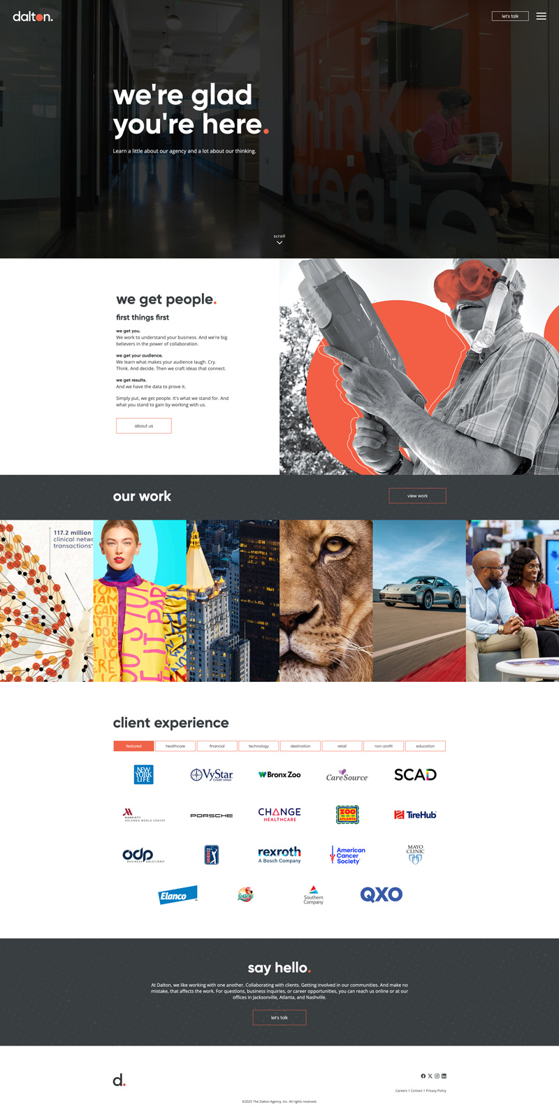
As part of the rebrand, I also redesigned Dalton’s website to fully reflect the new look and feel. I wanted the site to feel as simple and confident as the brand itself, while giving people a clear sense of who we are and what we stand for.
I focused on creating a cohesive experience where our story, team, and work all connect seamlessly. The new site makes it easy to explore our capabilities and dive into client case studies, with a layout and visual system that truly bring the Dalton brand to life.


